


In an age when people are using their mobile devices to browse the web, providing responsive navigation is now a necessity for all Malaysian businesses going online.
A responsive navigation bar is a simple yet vital tool that all businesses should include on their website if they want to offer potential customers the best online user experience (UX).
What is a Responsive Navigation Bar?
A responsive navigation bar (or navbar) is a section of the user interface (UI) that allows users to quickly and easily access your website’s features while also adapting and adjusting the layout and appearance based on their screen size and device type.
What is the Role of a Top Navigation Bar?
A navigation bar facilitates faster and easier browsing through your website. It organises the linking of other (usually internal) web pages through buttons or hyperlinks, enabling users to quickly access any page that is important or looks interesting to them.
Creating an effective and efficient navbar requires considering and following the core rules of user-friendly navigation design.
What Are the Rules for A User-Friendly Navigation Bar Design?
Creating a navigation bar that enhances the user experience involves focusing on three core principles:
- Usability: Ensures the navigation bar is easy for visitors to use, enabling them to search your website quickly with minimal frustration and confusion.
- Learnability: Ensures that the navigation bar is designed to be intuitive, making first-time exploration easy and requiring minimal repetition.
- Accessibility: Ensures your navigation bar is inclusive and accessible to all users, especially those with disabilities, providing a seamless browsing experience.
What Makes a Good Navigation Bar?
A good navigation bar has the following features:
- Simplicity: The navbar should be simple and brief, with easy-to-read text.
- Consistent: The navbar should look and work the same across different devices and browsers.
- Logical: The links should be organised according to their importance.
- Familiar: The navbar should follow standard navigation patterns that users are familiar with, such as placing it at the top or side of the page.
- Helpful: The navbar must include essential pages such as About, Contact Us, Products and/or Services, Resources, etc.
- Responsive: The navbar should be able to adjust to any screen size and device type.
What Are the Types of Responsive Navigation Bars?
Here are the common types of responsive navigation bar:
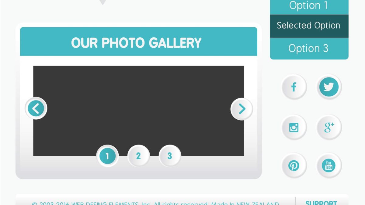
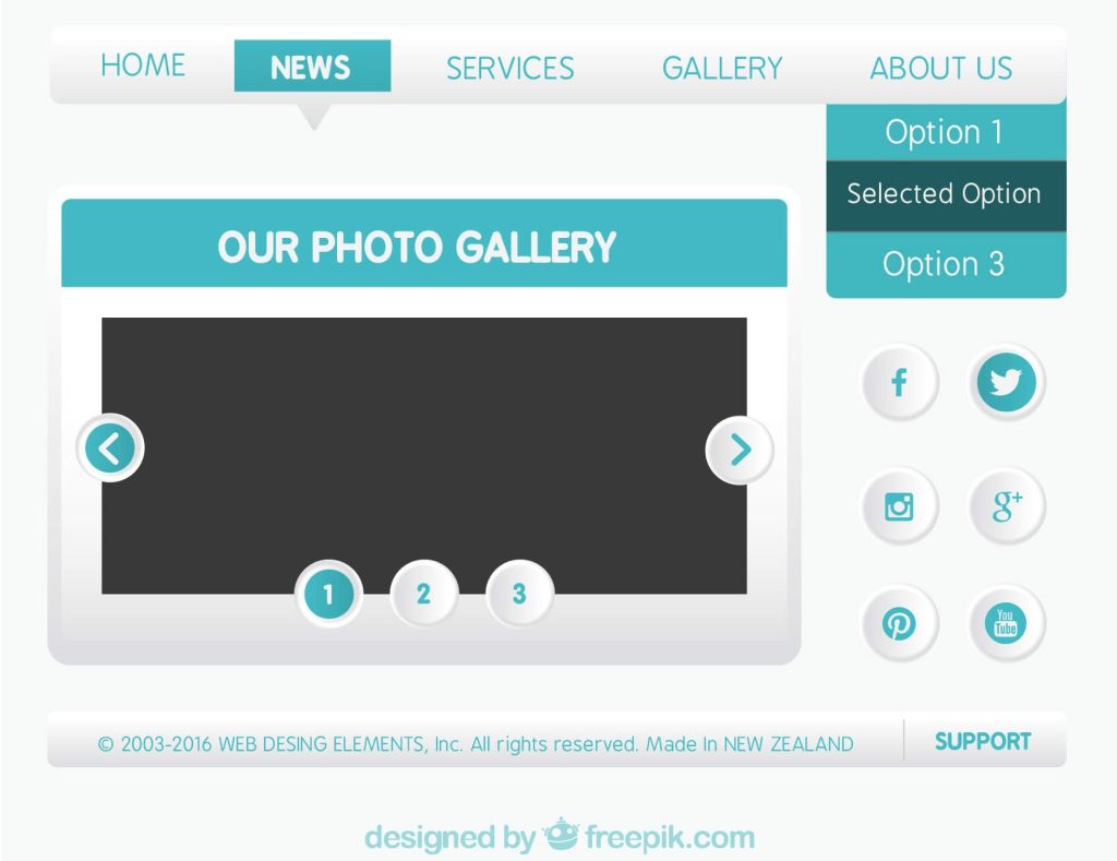
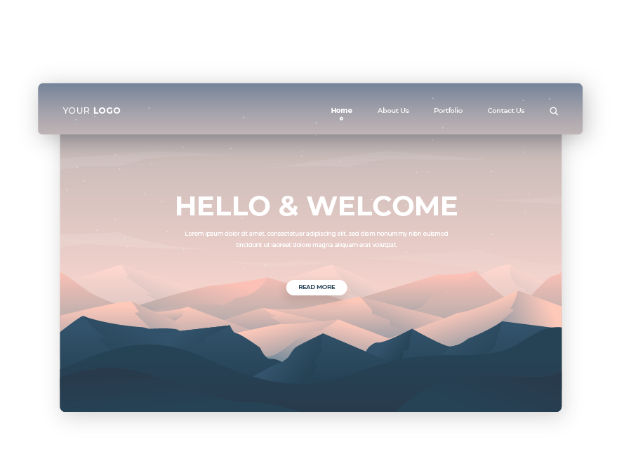
- Horizontal: The standard text-based navigation bar that is placed at the top of the web page. It ensures that all the important CTA links are available in front.
- Vertical: A common alternative to the horizontal navigation bar. This design is placed on the side of the web page and displays the links in descending order. It is one of the more common options for mobile chat group apps.

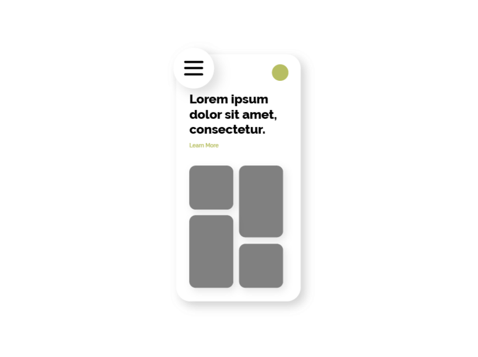
- Hamburger menu: The hamburger menu involves a compact, three-line button that consolidates a list of links. Due to its space-saving form, it is a very popular style for mobile apps like WhatsApp or Slack.
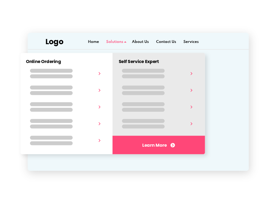
- Mega menu: This design includes links to every category and subcategory on the site. It allows visitors to understand what is available at a glance, and it is a common option for eCommerce sites like Amazon or Shopee.
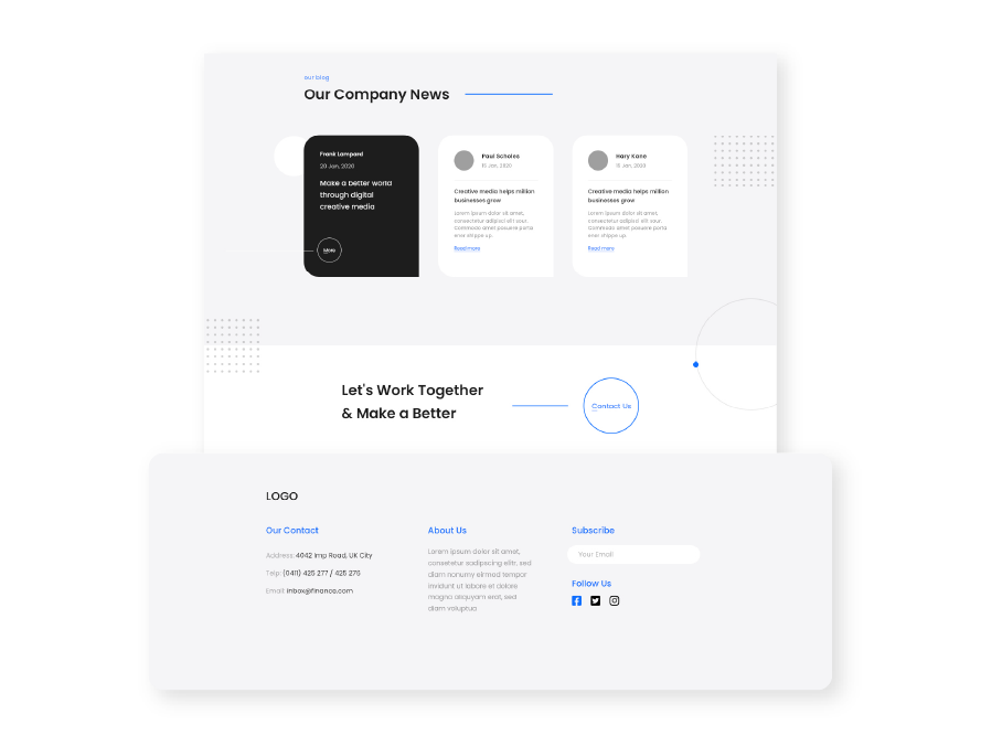
- Footer: This menu is placed at the bottom of the web page and usually includes the most important CTA links. This ensures that people who are unable to find the page they want to go to will be able to find the link after scrolling down the page.
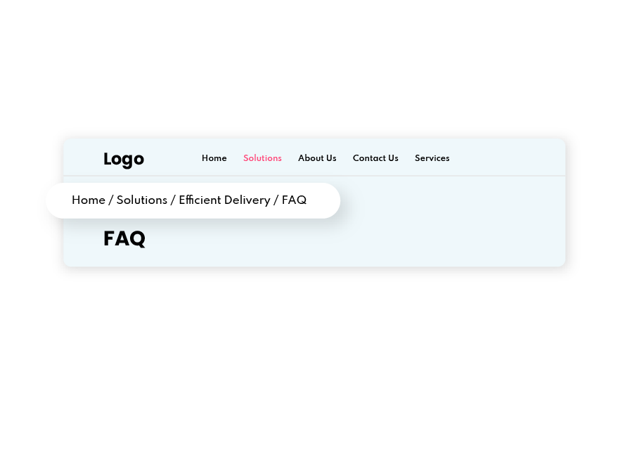
- Breadcrumbs: Breadcrumbs navigation displays links in a hierarchical manner, showing how they are nested within each other. It is commonly used in blogs and eCommerce websites.
What Are Effective Navigation Menu Design Practices?
Here are 7 best practices for creating an effective, responsive navigation bar that improves mobile users’ UX:
Mobile optimisation
Mobile optimisation is an essential element of responsive design. It ensures that your navigation bar can adapt to any screen size and device type, granting the best possible user experience. The hamburger menu is a universal option for a mobile-optimised navigation bar.
Simplicity
Keep it simple. Try to limit your navigation bar to no more than seven links. Try to avoid using dropdown menus as they can be difficult for search engine bots to crawl for and will add extra steps to the navigation process.
Visibility
One of the principles of good navigation design is visibility. Even if you’re going for a more creative design, it is vital that you keep usability in mind. One way of ensuring visibility is to make your navigation bar static. This means it will remain fixed to its position as the user scrolls down the web page.
Separation
Creating separation will keep your navigation bar distinct from the rest of the site’s content. This is easy to accomplish with clever use of white space, contrasting colours, or adding a simple dividing line. Separating the navigation bar from the other elements on the page makes it easier for visitors to tell which text is clickable, even if they share the same font.
Search functions
Adding a search engine to your navigation bar is a simple yet essential element for larger websites. This enables users to input keywords to find specific content on the site directly. Adding an autocomplete or instant search results feature to the search bar will make navigation easier for your visitors.
Menu order
Order matters in navigation bar design. Users are more likely to remember the first and last items in a menu. As such, your navbar should start its list with a “Services” or “Shop” page and end it with a call-to-action (CTA), like “Contact” or “Checkout”.
Only use buttons for CTAs
Buttons are a great way to draw attention to links and are best used for CTAs like “Contact Us” or “Sign Up Now.” Therefore, it is best to use buttons sparingly in your navigation bar so that your important CTAs will stand out from the rest of the text.
How to Create a Responsive Navigation Bar With a Drop-Down Menu?
Here are the steps for building a responsive navigation bar with a drop-down menu:
- Create a basic HTML structure for your web page and add markups for some nav elements and a drop-down button. This ensures that when a user hovers over the drop-down menu, it is visible to the user.
- Use CSS to style your navbar elements, including fonts, colours, spacing, and layout.
- Add Javascript so that the site will show the hamburger menu on smaller screens and an event listener on it to show the navbar on a small screen.
- Finally, use CSS media query to make your website responsive.
Conclusion
The navigation bar is a simple yet powerful feature that any good Malaysian business must use for its website. With the continuing growth in mobile device users, offering a seamless user experience is crucial for the lifeline of your online presence. Making it easier for mobile users to navigate through your website will improve their opinion of your brand and, thus, boost your SEO rankings. Read more about The Importance of Website Navigation: A Clear Path to Brand ConsistencyCreate a Responsive Navigation Bar With BikeBear!
BikeBear is the preeminent web design company in Malaysia, making us your go-to choice for web design assistance. Our professional team of web design experts will help you design a responsive navigation bar perfect for providing seamless user experiences on any device and screen size.Contact us now and start designing the perfect navigation bar for your business’s website.

