


OHSEM PASTA
QUICK TAKE
A NICHE BRAND CAN BE REBRANDED TO SOMETHING OHSEM!
What happens when everyone is on house lockdown, and you can’t enjoy your favourite restaurants anymore? That was the question looming over the economy at the peak of the global pandemic. But while others were scrambling for answers, Pasta Ohsem stepped up—bringing hot, fast, and ohsem pasta straight to home-abiding citizens craving a taste of comfort.

THE FULL STORY
When Pasta Ohsem came to us, their business was already booming, with a loyal fanbase eager for more creamy, savory Italian cuisine. But Pasta Ohsem wanted more—something that could reach a wider audience and touch hearts beyond the usual pasta-loving crowd. And guess what? They already had the menu to do it. From crowd-pleasing nasi meals to delectable, melt-in-your-mouth cheesecakes, they had expanded far beyond just pasta.
But despite their diverse offerings, they were still shackled by their own brand name: Pasta Ohsem. A name that screamed pasta, and nothing else. While pasta fanatics flocked to them, those who weren’t big on pasta barely gave them a second look.
The logo—featuring pasta noodles and a fork—only reinforced the idea that if you weren’t craving pasta, this wasn’t the place for you.
And so, they turned to us for the next step.
How could they break free from their niche without losing their identity?
Our answer? Don’t take the next step—take the next paw. We listened, we understood, and we worked tirelessly (with some well-deserved hibernation breaks) to find a way to realign their brand without losing what made it special. And then, the epiphany came.
THE OHSEM TRANSFORMATION
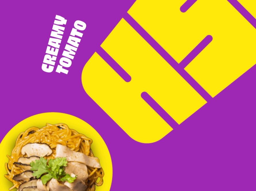
The key wasn’t a full-scale rebrand—it was a small but powerful tweak. The brand already had an edge: a name that felt local, fun, and undeniably Malaysian. So instead of changing it completely, we simply dropped the word “Pasta.” Just like that, Ohsem was born.
Stripping away “Pasta” removed the barrier that kept new customers from coming in. Now, Ohsem wasn’t just about pasta—it was about ohsem rice dishes, ohsem cheesecakes, and everything else they had to offer. It was an open-ended statement, ready to be filled with all things ohsem.
The logo followed suit. The pasta-inspired typography that once limited their reach was reimagined into something more inclusive—an exclamation mark, bold and striking. It wasn’t just a logo; it was a statement. A declaration that whatever Ohsem served, it was so ohsem, you couldn’t help but exclaim it out loud.
With a bold yet simple aesthetic, the rebranding of Ohsem proves that you don’t need to erase what makes you unique to evolve. Sometimes, all it takes is the right tweaks in the right places—to turn something good into something ohsem.


