


How to Design an Education Web Page?

Key Takeaways
- Effective education web page design starts with intuitive navigation, mobile-first responsiveness, and content-rich layouts that help parents find key information fast.
- Every educational web page should include a strong hero section, clear CTAs, fast load times, and social proof like testimonials or accreditation badges.
- Follow the "golden" landing page structure: hook, curriculum, instructor, outcome, social proof, trust signals, and FAQs to guide visitors toward enrolment.
- Avoid common pitfalls like cluttered layouts, weak visuals, poor readability, and missing calls-to-action that push prospective families away.
Introduction
Whether you're a primary school, university, course creator, or edtech startup, your website is often the first interaction a parent or prospective student has with your institution. That first impression shapes whether someone enquires or clicks away.
This guide covers the design principles, essential elements, and content strategies behind an effective education web page, one that builds trust, communicates value, and converts visitors into enrolled students.
In short, to design an educational website that works, you need intuitive navigation, mobile-first responsiveness, content-rich pages that answer real questions, and clear calls-to-action that guide visitors toward enrolment. The sections below break down exactly how to get each of these right.
Why is Good Design Important for an Educational Web Page?
Parents researching schools and programmes are making high-stakes decisions; they're choosing where to invest in their child's future.
A poorly designed website signals a lack of professionalism, and in a competitive market, that's often enough for a prospective family to look elsewhere. Good education web page design isn't just about aesthetics; it's about communicating credibility at first glance and making it easy for visitors to find the information they need to take the next step.
What Are the Benefits of a Well-Designed Educational Web Page?
Here's what a well-designed web page can do for your institution:
- Credibility & Trust: A polished, professional design reassures parents that your institution takes quality seriously, across the board, not just on screen.
- Improved Learning Experience: Prospective students and parents can easily explore programmes, resources, and campus life without frustration.
- Higher Enrolment & Conversion Rates: Clear layouts and strong calls-to-action guide visitors naturally from browsing to submitting an enquiry or application.
- Reduced Support Enquiries: When key information like fees, schedules, and admissions requirements is easy to find, your admin team fields fewer repetitive questions.
- Better Accessibility Compliance: Inclusive design ensures your website serves all users, including those with disabilities, a growing expectation across Malaysia and globally.
What Are the Key Design Principles for Educational Websites to Follow?
Before diving into specific elements, it helps to understand the foundational principles that guide effective education web design. These apply whether you're building a full university site or a single course landing page.
Intuitive Navigation & Structure
Organise content with a clear, hierarchical structure. Use sticky headers, logical menus, and breadcrumbs so that parents and students can find what they need, whether that's admissions, programmes, or fees, without guessing. The more pages your site has, the more critical this becomes.
For a deeper dive, check out our complete guide to website navigation.
Effective Use of White Space
Education sites often need to present a lot of information, and cramped layouts make everything harder to absorb. Generous spacing between sections, text blocks, and images gives your content room to breathe and keeps visitors reading instead of bouncing.
Mobile-First & Responsive
A large percentage of parents and students browse on their phones, especially during commutes or between classes. Your site needs to function well on smartphones, not just look acceptable. Buttons should be tappable, text readable without zooming, and forms must be easy to complete on a small screen.
Learn more about why mobile-first design matters.
Accessibility & Inclusivity
Design for everyone. That means high colour contrast for readability, alt text on images, keyboard-friendly navigation, and potentially multilingual support for Malaysia's diverse population. Accessibility isn't just good practice; it widens your reach and shows that your institution values inclusivity.
Content-Rich (Not Minimalist)
Unlike corporate websites that thrive on minimalism, educational sites need depth. Parents want detailed programme descriptions, academic calendars, faculty credentials, and campus facilities. Don't strip content away in the name of clean design. Instead, structure it well so density doesn't become clutter.
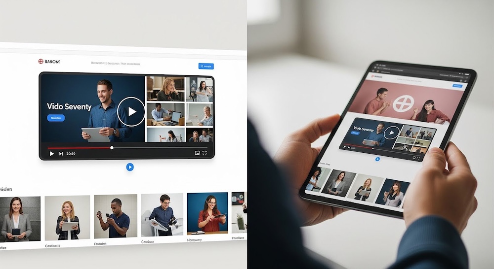
Engaging Visuals
High-quality images, videos, and interactive elements like virtual campus tours or programme explainers can boost engagement significantly. The key is to use visuals that support your message rather than overwhelm it. Real photos of your campus, students, and staff will always outperform generic stock imagery.
For more on designing effective school websites, see our guide on school website design.
What Are the Essential Design Elements to Include on Your Educational Web Page?
Principles guide your approach, but elements are what you actually build. Here are the components every effective educational web page should include:
- Clear Hierarchy: Place critical information like admissions deadlines, contact details, and key dates front and centre. Don't make parents dig through multiple pages to find what matters most.
- Hero Section: Lead with a high-quality photo of real people, your students, your campus, paired with a clear H1 headline. Use real photos rather than generic stock imagery; authenticity builds trust faster than polish.
- Search Functionality: For institutions with large course catalogues or resource libraries, a prominent search bar is essential. Users shouldn't have to click through dozens of pages to find a specific programme.
- Page Speed & Performance: Slow load times disproportionately affect students on mobile or low-bandwidth connections. Compress images, minimise scripts, and test your site regularly to keep it fast.
- Branding & Colour Theory: Use a consistent, professional colour palette that reflects your institution's identity. Blue conveys trust, green suggests growth, and red brings energy. Choose intentionally. Read more about website branding. For a deeper look at how colour influences perception, read our guide to colour theory in web design.
- CMS & Content Flexibility: Schools update terms, courses, and events frequently. A flexible content management system ensures your team can make changes without needing a developer every time.
- Social Proof: Display logos of partner institutions, alumni testimonials, employment rates, or accreditation badges. Parents want evidence that your institution delivers on its promises. Explore more about Bikebear’s social media marketing strategies!
- Updated Content: Design with flexible layouts that make it easy to refresh news, events, and course offerings regularly. A site full of outdated information erodes confidence quickly.
- Clear CTAs: Use contrasting colours for buttons like "Apply Now," "Book a Tour," or "Enrol Today." Every page should have a clear next step so visitors aren't left wondering what to do.
The "Golden" Content Structure For An Educational Landing Page
If you're designing a single landing page for a course or programme, this flow is your blueprint. Each section answers a specific question in the parent's or student's mind, moving them from curiosity to confidence:
- The Hook: What problem does this education solve? Lead with a clear, outcome-driven statement. For example: "Master Python in 12 Weeks" or "Prepare Your Child for Top Secondary Schools." This is what stops the scroll.
- The Curriculum: Lay out what will be learned in a scannable format. Use short descriptions grouped by module or term. Parents want to see substance, not vague promises.
- The Instructor: A brief bio with credentials and teaching experience. This establishes authority and gives a human face to the programme.
- The Outcome: What does the student walk away with? A recognised certification, improved grades, and job-readiness. Spell out the tangible result.
- Social Proof: Student reviews, success stories, outcome statistics, or logos from partnering organisations. This is where trust is built through the experiences of others.
- Trust Signals: Accreditation badges, money-back guarantees, or affiliations with recognised educational bodies. These reduce the perceived risk of committing.
- FAQs: Address the practical concerns that hold people back, such as pricing, time commitment, prerequisites, class sizes, and refund policies. Answering these upfront removes friction from the decision.

This structure works because it mirrors how people actually make decisions: understand the value, evaluate the detail, seek reassurance, then act. Whether you're promoting a coding bootcamp or a university diploma, this framework adapts to fit.
What Pitfalls Should I Avoid When Designing My Web Page?
Even well-intentioned designs can fall short. Here are the most common mistakes to watch for when designing an educational website:
- Overloading Users: Trying to say everything on one page overwhelms visitors. Prioritise key information and let secondary details live on dedicated subpages. Structure beats volume every time.
- Poor Readability: Small fonts, low contrast, and dense paragraphs make content painful to read, especially on mobile. Stick to legible font sizes, clear line spacing, and short paragraphs.
- No Clear CTA: If a visitor finishes reading your page and doesn't know what to do next, that's a missed opportunity. Every page should guide users toward a specific action, whether it's applying, enquiring, or booking a visit.
- Weak Visuals: Blurry images, outdated photography, or overused stock photos undermine your credibility. Invest in authentic, high-quality visuals that reflect your institution as it is today.
- Forgetting Mobile Users: If your site isn't built mobile-first, you're ignoring a significant portion of your audience. Forms that are impossible to fill on a phone, buttons too small to tap, or layouts that break on smaller screens all push prospective families away.
 Web Page Design Mistakes Infographic
 Avoiding these pitfalls doesn't require a massive budget. It requires intentional design decisions and a willingness to test your site from the user's perspective.
Conclusion
Designing an education web page well means removing every barrier between your audience and the information they need. Parents and students aren't browsing casually; they're deciding whether your institution deserves their trust.
Here's what to keep in mind:
- Design with purpose: Prioritise navigation, mobile responsiveness, and accessibility.
- Include what matters: A strong hero section, clear CTAs, social proof, and fast load times.
- Structure for conversion: Follow the "golden" content flow to move visitors from interest to action.
- Avoid the basics: Don't let weak visuals, cluttered layouts, or missing CTAs undermine your credibility.
If you're an educational institution in Malaysia looking to build or redesign your website, Bike Bear can help. We specialise in education web design that turns online visitors into enrolled students, from strategy through to launch. Get in touch now!


