



Key Takeaways
- A business homepage acts as a digital storefront that shapes first impressions, builds trust, and drives conversions.
- Effective homepage design should include a clear hero section, strong CTA, service overview, trust signals, testimonials, and contact information.
- Homepages focus on brand awareness and exploration, while landing pages are designed around a single conversion goal.
- A strong homepage structure guides visitors logically from awareness to action using clear messaging and strategic section flow.
- Mobile-friendly design, fast loading speed, simple navigation, and consistent branding are essential for modern homepage performance and SEO.
- Trust signals such as testimonials, certifications, reviews, and client logos help reduce visitor hesitation and improve conversion rates.
Introduction
In the current information era, lacking a website puts businesses at a significant disadvantage, raising doubts about their legitimacy.
Your business website homepage is your digital storefront, transcending national borders. In today's cutthroat digital environment, it works while you sleep. Get it right, and you win customers. Get it wrong, and they leave fast.
What Is the Purpose of a Homepage?
Before we get ahead of ourselves, a homepage is the primary entry point that visitors see whenever they first navigate to a website's domain. Located at the root of a website's URL, it typically provides an overview of what the site offers.
In practice, a homepage serves different purposes as the starting point of a website:
- First impressions: It establishes the tone and first impression.
- Explaining what the business does quickly: It communicates your purpose or mission, helping visitors understand whether they're in the right place.
- Guiding users toward the next action: Includes key elements like navigation menus, calls-to-action, and essential information optimised for engagement.
- Supporting SEO and conversions: Search engines read keywords and meta descriptions on your homepage to improve visibility. Relatedly, conversion-focused elements like testimonials and trust signals turn visitors into leads and customers.
Homepage vs Landing Page: What's the Difference?
Homepages and landing pages serve fundamentally different purposes in one's digital strategy. Let's illustrate how, shall we?
- Goals: Homepages are natively designed for exploration and brand awareness. Landing pages are action-oriented with one singular objective.
- User Intent: Homepage visitors typically have broad, exploratory intent. Landing page visitors often arrive with a specific intent.
Overall, homepages build trust. Landing pages drive a single action. Do not confuse them.
What Should Be Included on a Business Website Homepage?
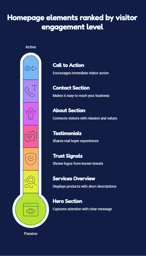
A high-performing homepage strategically combines multiple elements that work cohesively to inform, engage, and convert visitors. Let's skip any guesswork and discuss these elements in detail:
Hero section design with a clear headline
The hero section is the first thing people see. It's your most valuable real estate and captures visitor attention at its peak.
So, state who you help and how, with one clear sentence. Add a picture or video that supports your mission and resonates with your audience.
Strong call to action homepage section
Utilise one main CTA strategically above the fold. Add more later. But start with one clear ask, focusing on your main conversion goal. For instance, "Get a Free Quote," "Start Your Trial". Secondary CTAs lower on the page can offer alternative actions like "Learn More" or "View Pricing".
Services or product overview
Provide a clear and scannable way to show what you sell. Display three to six items max, leveraging a three-column layout or a card-based design. Each item needs a short title, image/icon and description.
Trust signals and client logos
Logos from known partnering brands build credibility and trust fast. Visual trust indicators reassure new visitors that established organisations have validated your business. So, show them to reinforce confidence at critical decision points.
Testimonials or case studies
Real words from real buyers win sales. So, do not hide any social proof like testimonials, case studies, awards, certifications and media mentions. These demonstrate real-world results and build emotional trust. So, position them after explaining your services.
About/company introduction
A concise "About" or "Our Story" section humanises your brand. It also helps visitors connect with your mission and values. Always keep this brief on the homepage (2-3 sentences) with a link to your full 'About' page.
Contact or enquiry section
Make it effortless to reach you. Put a phone number, email, or form in both your header/footer. Multiple contact options accommodate different communication preferences. In fact, add your address if you have a physical store.
What Makes a Good Website Homepage (Best Practices)?
Great homepages follow proven design rules and user experience principles to drive results. Here are the rules that work.
Clear messaging above the fold
'Above the fold' is the part of the homepage visible before scrolling. It is typically the first 600-1000 pixels from the top. The idea is that visitors should immediately understand what your business does within 3-5 seconds.
So, place a compelling headline and primary CTA above the fold. Additionally, avoid jargon and use clear, benefit-focused language.
Simple homepage layout and navigation
A clean, uncluttered design with sufficient whitespace helps visitors focus on what matters most. So, limit your main navigation menu to 5-7 items. Additionally, organise content into logical sections with a clear visual hierarchy. Lastly, employ consistent spacing and alignment throughout.
Mobile-friendly website homepage design
Responsive design is no longer optional in today's mobile-driven landscape. So, employ a mobile-first web design that automatically adapts to different screen sizes. This should be complemented by touch-friendly buttons and fast-loading mobile-optimised images.
Fast loading speed and visual clarity
Page speed directly impacts user experience and search rankings. So, aim for a homepage that loads in under 3 seconds. To this end, optimise images by compressing file sizes and minimising heavy scripts.
Additionally, use high-quality images, strong colour contrast, and readable typography for visual clarity.
Consistent branding and CTA placement
Maintain visual consistency through your colour palette, typography, imagery style, and tone of voice. Collectively, these consistent elements reinforce brand recognition and professionalism whilst reducing cognitive overload.
Additionally, place CTAs strategically throughout the page using the same design style and action-oriented language. This enables visitors to always know the next step.
What Is a Hero Section and Why Does It Matter?
The hero section is the big, eye-catching region at the top of one's homepage. It shows up right away when users land on your website—before they browse or click anything.
An effective hero section directly impacts bounce rates and conversion funnel initiation. It does so by instantly answering the visitor's fundamental question: "Am I in the right place?"
What should go inside a homepage hero section?
This crucial first impression area usually consists of:
- A bold headline that communicates one's core value proposition
- A supporting subheadline for context
- A main CTA button with action-oriented text in a contrasting colour that stands out.
- A high-quality visual element (image/video).
How to Structure a Website Homepage?
A well-structured homepage follows a logical, strategic flow. This flow guides visitors through a conversion journey—from initial awareness to taking action. Here is the ideal homepage section-by-section flow:
- Hero section: Grab attention. State your offer. Ask for the click. These critical first 3-5 seconds determine whether visitors stay or leave.
- Services/products: Present an overview of your main offerings using a scannable format. Keep it brief.
- Why choose us: Differentiate yourself from competitors by showcasing your unique advantages.
- Social proof: Add testimonials, logos, or reviews.
- CTA section: Ask for the sale again. Use different compelling words.
- Footer: Close with a comprehensive footer containing essential navigation links, contact information, social media icons, and legal pages (privacy policy, terms).
How many sections should a homepage have?
Most effective homepages contain 6-8 core sections. This offers the optimal balance between providing comprehensive information and maintaining user engagement.
What should be above the fold?
Visitors form often opinions about your website in as little as 50 milliseconds. So, your above-the-fold content should be the hero section content only.
What Are Trust Signals and Where Should They Go?
Trust signals are visual and textual elements on one's homepage that build credibility, reduce visitor anxiety, and demonstrate business legitimacy. Generally, trust signals serve as digital proof points that reassure sceptical visitors and validate a business's claims. These often include: testimonials, certifications, reviews, and awards.
When placing testimonials, place one strong quote in the hero area. Additionally, put two to three more after your services and a video testimonial near the footer. Relatedly, show badges from trusted groups and Google star ratings near your contact section or footer.
Common Homepage Design Mistakes Businesses Make
Even with the best intentions, smart business owners can make homepage design mistakes. Here are some to avoid:
- Trying to say everything at once: You're selling a solution, not a novel. Pick one main message. Save the rest for inside pages.
- Weak or unclear headlines: Generic, vague headlines waste your most valuable real estate. They fail to communicate why visitors should care.
- Too many CTAs: Cluttering your homepage with multiple competing CTAs creates decision paralysis and dilutes focus.
- Poor mobile experience: Tiny, unreadable text, slow-loading images, and horizontal scrolling requirements negatively affect the mobile experience.
- Lack of trust signals: No logos. No testimonials. No reviews. This makes buyers assume the worst. Add proof early and often.
How Do You Know if Your Homepage Is Working?
You cannot guess. You must measure. Consider leveraging these metrics to check your homepage's health and whether it's achieving your business goals.
- Bounce rate and engagement metrics: A high bounce rate means people leave fast, without interacting. Additionally, leverage engagement metrics like average session duration and pages per session to understand if your homepage successfully guides visitors deeper into your site.
- CTA clicks and enquiries: Click-through rate (CTR) on your CTAs shows whether your messaging and design compel action. So, track every button click and count every form filled.
- Scroll depth and conversion tracking: Scroll depth tracking shows what percentage of visitors scroll to different homepage sections. If they stop at 30%, move key content up.
Also read: The true ROI of web design for Malaysian businesses.
FAQs
Should I use a slider or a static hero image?
Use one static image. Sliders kill conversions. Most people never see the second slide. Pick one strong image and one clear message.
Where should I place CTAs on my homepage?
Place your primary CTA in at least three strategic locations throughout your homepage. First, in your hero section above the fold, after your services or product overview section, near the bottom of your homepage, just before your footer.
What are the most important homepage trust signals?
Client logos, real testimonials, star ratings, security badges and money-back guarantees. Put these where people look first.
Should my homepage include a video?
Yes, but only a short one. In essence, keep it under 90 seconds and hire a professional video production content marketing team to do it.
Should I show pricing on my homepage?
It really depends. Low-cost items benefit from visible prices. High-cost services should not show prices upfront. Test both ways if you are unsure.
Do I need a blog feed on the homepage?
No, blog feeds distract from sales. Put recent posts on a separate blog page. Utilise homepage space for offers, not articles.
Does homepage design affect SEO?
Google uses mobile-first indexing. This means your homepage's mobile design and performance directly affect your entire site's SEO rankings.
Conclusion
A high-performing business website homepage serves as the foundation for online credibility, lead generation, and revenue growth. In fact, a clean, conversion-focused homepage often turns strangers into buyers.
In essence, it sets the tone for every customer relationship and answers critical questions within seconds. Thereby, building trust and working while you sleep. To this end, your homepage needs a clear hero section, strong CTA, service overview, trust signals, testimonials, about intro, and contact info.
Stop guessing. Start building. Get a homepage that sells by engaging Bike Bear's professional web design team to turn visitors into loyal customers.